

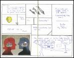


1. When I first arrived at my school eleven years ago, one of my early mentors was a woman who for a variety of complicated reasons decided to leave the school. Once she was no longer teaching, she started a small business making cards with calligraphic images on them. Recently, she made the decision to go back to teaching and asked me to write her a recommendation. About two weeks ago, I got a card from her telling me she had accepted a teaching job in a school in Africa. The character depicted on the card is “wa,” which means “balance.”
2. Until recently I had never heard of Joseph Cornell, who managed during the middle part of the 20th century to create an impressive body of beautiful and highly idiosyncratic work, much of which was assemblage in the form of boxes. Following his lead, I’ve begun visiting the local Goodwill Store periodically to see what’s around that might be interesting or useful. Last week I found a thin rectangular hinged mahogany box of the kind that steak knife sets come in. I brought it home with the idea that I might eventually try to put together a Cornell-type box. I started by removing the black velveteen contact paper lining the inside of the top of the box. It tore out in one piece, and I was pleasantly surprised by the texture and pattern of the glued surface on the back of the contact paper, and decided I’d use it here.
3. When I am painting I often need to unload excess paint from a brush, and so I often use a sheet of heavy paper as a repository of the leftover paint. That way, each time I clean out a brush, I’m contributing to the ongoing development of a kind of loosely abstract paint collage. I often find later that I can use strips or random shapes from that paper in other pieces I’m working on, which makes for a sort of hidden thread of connection leading from one piece to the next. The circular cutout from the black-and-white portion of this rectangle wound in another piece, which, as it happens, turned out to be a very busy, muddy, frustrating piece to work on (see below).
4. One the second floor our local art store there is a rack of handmade papers that come in large sheets in various colors. This particular paper, which I found last month, is rough-textured, heavy paper, black on one side and a rich blood red on the other. It holds up well when you soak it with water, which makes it ideal for collage, because the soaked paper will lie flat on the panel and adhere well.
5. Another panel from the knife box, this time from the bottom of the box.
6. A very small piece of patterned paper, blue with a gold filigree pattern, from the same rack as the red paper above, but from a more recent trip to the art store.
7. I don’t like most furniture stores. Too much plastic, too much bad design, too much soul-less, history-less dreck. Not to mention that the salespeople are often off-putting. The exception in my town is C.S. Wo, which imports most of its furniture from China. Some of it is antique, some of it is modern, but all of it is interesting to look at. Going there is as entertaining as going to a museum. The salespeople are helpful when you need them but otherwise give you plenty of room. And did I mention that they have free coffee and chocolate chip cookies? Anyway, every once in a while they hold an open house, and on this particular open house they were offering a free set of year-of-the-ox greeting cards to the first 100 people to show up. We were third in line.
8. My father-in-law got me interested in statehood quarters. This is the quarter from Hawaii. I felt that I needed something to go into the empty circle I had cut out of the paper, and since I had the whole balance thing going, I thought that the Hawaii quarter might serve as the symbol serving to bridge the eastern and western influences in the collage, much as the state itself serves as a middle ground between East and West.
9. The second panel from the bottom of the knife box.
10. There’s a huge stationery discount warehouse downtown which sells washi paper in small color-coordinated packets. The packets are sealed, so there’s a little sheet inside which has thumbnail pictures which show what the patterns are on the paper you’d be getting in the packet. I was looking to balance shapes and colors and sizes of the elements I was putting together here, and this little piece seemed to work just fine.
11. The white rectangle here is a leftover piece from the collage I mentioned before that got too busy. I had been looking at an issue of Artnews and I saw a collage which was basically a sort of two-dimensional architectural assemblage made by arranging white rectangles with dark borders in a latticework over a red background. So I made a bunch of rectangles and laid down a background with the same red paper you see here and began working on something that looked pretty interesting at the start, but then got progressively more fussy and ugly until I basically just painted the whole thing over in white, which made it too simple and not interesting to look at, so then I started adding other elements back in, and went through the whole stupid sequence again and finished with something I don’t even want to look at myself, which is, as I said, why I decided to go simple with this one. This white stripe is my little gesture toward giving embedding in this little creation a little fragment of its prehistory.
A picture, they say, is worth 1000 words. I’m done.

No comments:
Post a Comment