Here are three panels I've worked on this week.
I began this first one by gluing down four pieces of fabric onto an 18" plywood panel. (There is also, for no really good reason other than that I decided to try it, a bodhi leaf secreted beneath the swatch on the lower left side.) Then I coated the fabric with a blue-grey acrylic mixture, to which I added torn paper elements which were placed at least partially to obscure the seams between the different pices of fabric. One it was all dry, I used a wide, mostly dry brush to drag pigment along the ridges of the fabric in the upper left hand corner, creating the brocaded effect.
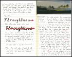
This is a reworking of an older 12-inch panel that felt unfinished. I added the handwritten text (readers with eagle eyes may recognize the text as part of the Saramago excerpt I posted last week, the one about the relationship between the brain-in-the fingers and the brain-in-the-head.) This was by way of an experiment. I had some semi-transparent mulberry paper I bought last week and I wanted to check if it would a) take the handwriting in ink without tearing or bleeding and b) if it would become essentially transparent when glued down with acrylic medium on top of other materials. The answer in both cases turned out to be be yes, so that's going to become an element in future works for sure.
Each of these panels seems to me to have a sort of character, a wordless but thought-inducing presence. I'm interested in how much of one's emotional reaction to a work of art is a function of color. Last night I bought an aloha shirt. There were actually three shirts on the rack with the same design, but in different color combinations. Two of them I wouldn't wear on a bet. The third one was just gorgeous: the colors worked with the forms in a way that is emotionally complex and satisfying, sort of like the way this panel works the white-yellow-orange-red-brown-black continuum.
Each of these panels seems to me to have a sort of character, a wordless but thought-inducing presence. I'm interested in how much of one's emotional reaction to a work of art is a function of color. Last night I bought an aloha shirt. There were actually three shirts on the rack with the same design, but in different color combinations. Two of them I wouldn't wear on a bet. The third one was just gorgeous: the colors worked with the forms in a way that is emotionally complex and satisfying, sort of like the way this panel works the white-yellow-orange-red-brown-black continuum.




No comments:
Post a Comment