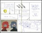
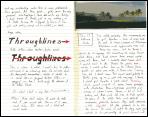
Managed to rescue yesterday's drawing. I found a blue tone
on an advertisement on a magazine cover that closely matched the blue ink I
used elsewhere in the drawing, and pasted over the offending black areas. Then
while inking I overshot one of the boundaries, so I had to blacken that area
in, and compensate by connecting several other shapes in the same way:
 |
| Retroactive |
Process Reflection: Two thoughts. First, with regard to the drawing, just a confirmation for myself that the mistakes are part of the process. I was tempted (twice) to throw what I had done out because something happened I hadn't planned for; instead, I wound up changing the plan to accommodate the mistakes. It came out okay, and in fact gave me a couple of ideas to work with the next time I try something. (I like the effect of the heavier black curved lines that now are part of the composition, and the idea of starting out with planning for some pasted-in elements also adds a new twist.) Second, with regard to the 64-word limit, I had trouble with that as well this time, but found (again) that having to "omit needless words" in order to get from 85 to 64 actually made for a more clear and compact end result.





No comments:
Post a Comment